What is Storybook?
Storybook is an open-source tool for developing UI components in isolation for React and other frameworks. It provides a “storybook” of components, allowing developers to create, view, and test components independently from the main application. Think of it as a dedicated workspace where you can focus on building and refining individual components without the distractions of the broader application context.
What are the advantages?
Using Storybook offers a range of benefits that can greatly enhance the development process and improve the quality of your application. Here are some key advantages:
- Component Isolation: Develop and test components in complete isolation, ensuring they work perfectly before integrating them into the main app.
- Improved Collaboration: Designers, developers, and testers can all use Storybook, making it easier to collaborate and provide feedback on components.
- Comprehensive Documentation: Each component’s different states and variations are documented visually, serving as a live style guide for your project.
- Faster Development: Quickly create and iterate on components without needing to navigate through the entire app, speeding up the development cycle.
- Enhanced Testing: Easily test various states and props of components, ensuring robust and reliable UI elements.
Creating components in isolation
Storybook allows you to build and view components in isolation, away from the complexities of your app. This means you can focus on perfecting the component’s design and functionality without worrying about the surrounding environment.
For example, you can create a button component and test its different states (normal, hovered, clicked, disabled) directly in Storybook:
// Button.stories.js
import React from 'react';
import { Button } from './Button';

export default {
  title: 'Example/Button',
  component: Button,
};

export const Primary = () => <Button primary>Primary Button</Button>;
export const Secondary = () => <Button>Secondary Button</Button>;
export const Disabled = () => <Button disabled>Disabled Button</Button>;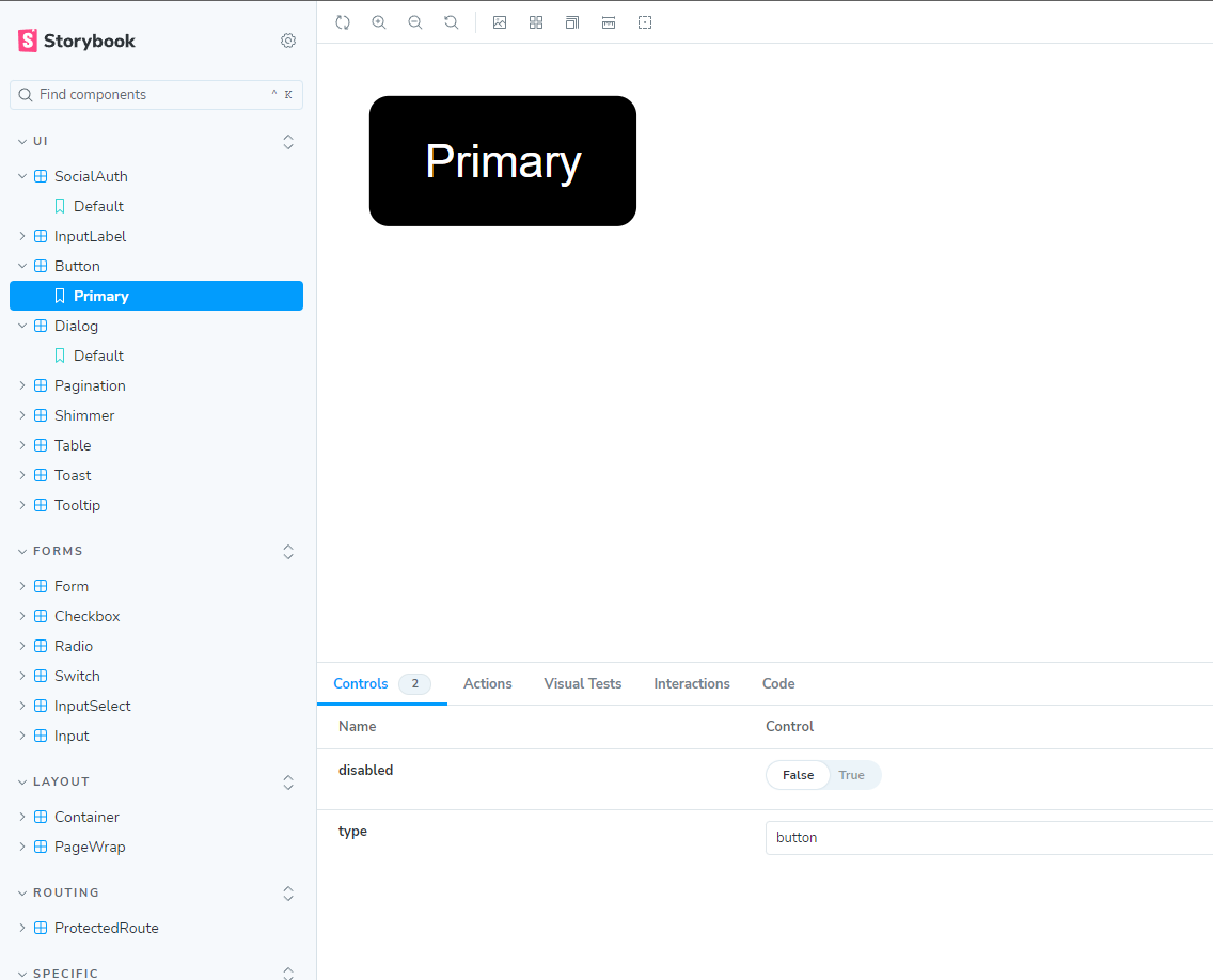
Easier and faster testing of states/props
With Storybook, you can easily test all possible states and props of a component, ensuring it behaves as expected in any situation. This comprehensive testing helps catch bugs early and ensures a smooth user experience.
// Button.stories.js (extended)
export const Variants = () => (
  <>
    <Button primary>Primary Button</Button>
    <Button>Secondary Button</Button>
    <Button disabled>Disabled Button</Button>
    <Button primary disabled>Primary Disabled Button</Button>
  </>
);
Fast configuration and implementation of new stories
Setting up new stories in Storybook is straightforward. By defining stories in a structured format, you can quickly add and view new components or variations:
// NewComponent.stories.js
import React from 'react';
import { NewComponent } from './NewComponent';

export default {
  title: 'Example/NewComponent',
  component: NewComponent,
};

export const Default = () => <NewComponent />;
export const WithProps = () => <NewComponent prop1="value1" prop2="value2" />;
Conclusion
Storybook is a powerful tool for developing, testing, and documenting React components in isolation. By providing a dedicated environment for component development, it streamlines the process, enhances collaboration, and ensures a consistent and robust user interface. Embracing Storybook in your React projects can lead to faster development cycles, improved component quality, and a better overall user experience.