
To address the challenge of developing software for various platforms, we need to take into account diverse screen sizes. Mobile applications are characterized by smaller screens, which additionally requires adapting menu/button layouts to the specific nature of mobile applications. In this chapter, a specific solution will be presented, which we can apply when simultaneously creating applications for different platforms.
Below is a macOS application, using it as an example to demonstrate handling responsiveness. The application shows how its appearance changes with the resizing of the window.
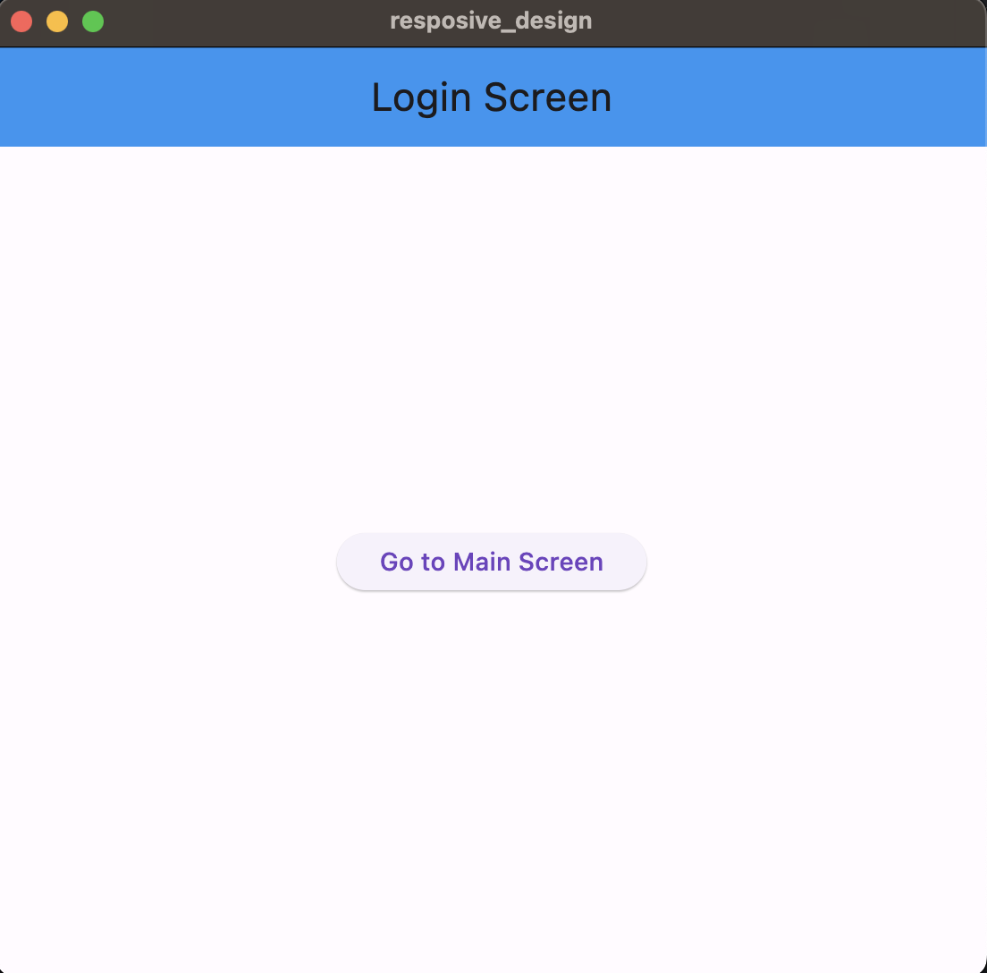
Common screen for all platforms, it doesn’t contain many elements, so there is no need to separate it into individual screens.
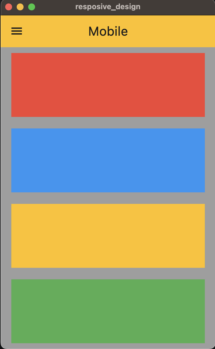
Mobile view of the application for a window smaller than 500px.
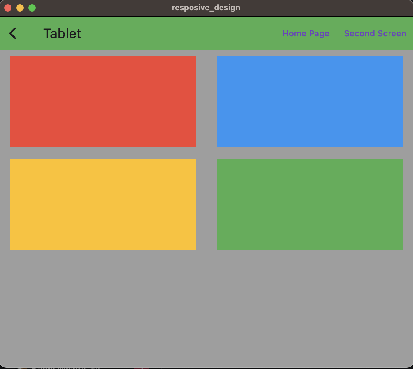
Application view for a tablet, i.e., a window smaller than 1100px.
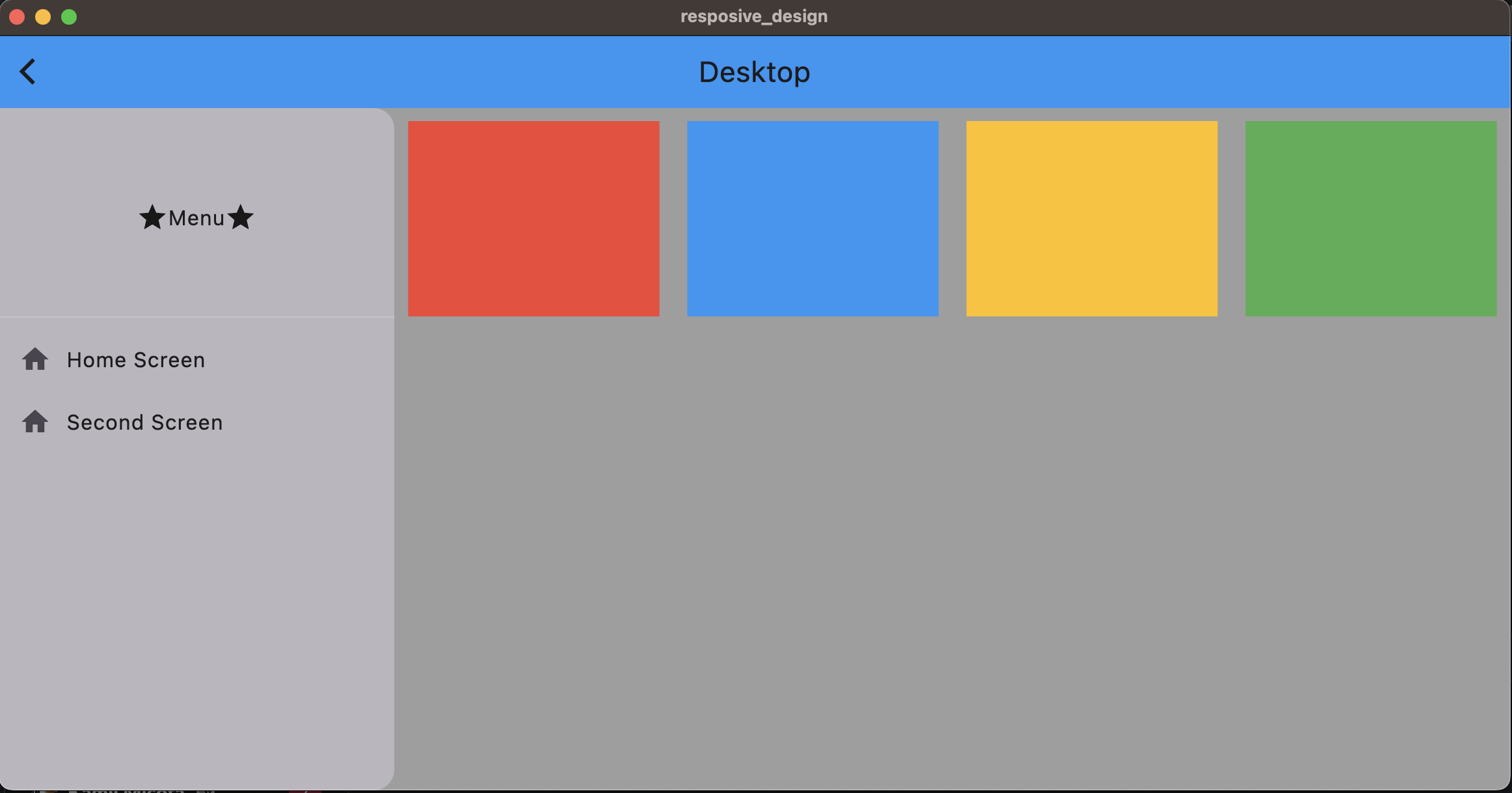
A view depicting the scenario where the screen size is larger than 1100px, indicating the desktop version of the application.
As you can see, the application operates on principles similar to web applications. During the design of websites, the application’s structure and arrangement of elements often appear similar. By creating views in this manner, we also enable the easy development of websites. This approach allows for the utilization of similar design concepts and elements, contributing to consistency in user experience across both mobile devices and websites. Consequently, users can easily navigate and interact with the application, regardless of the platform.
Description of the source code
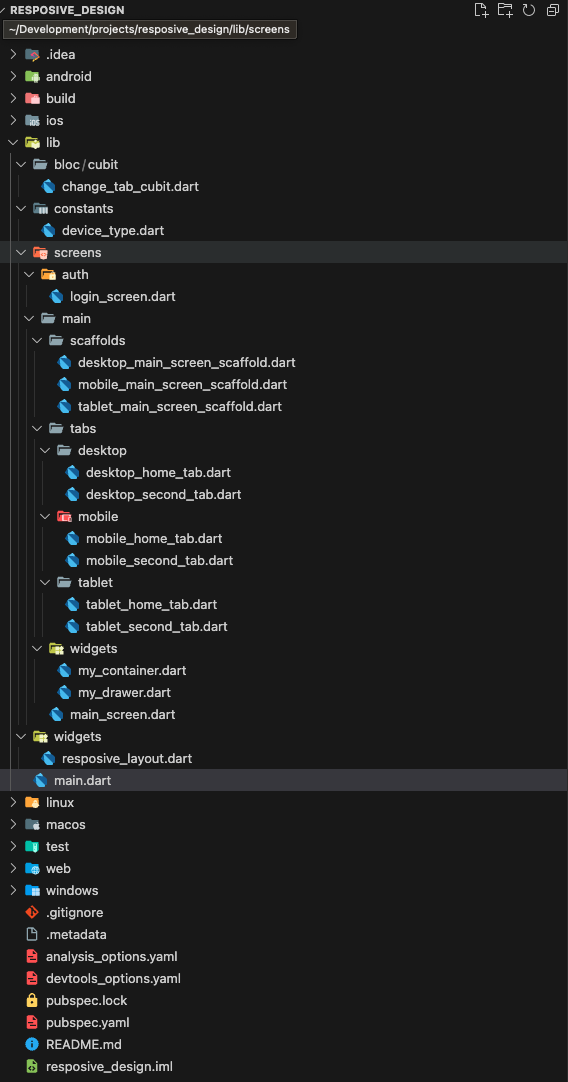
Project structure
main.dart
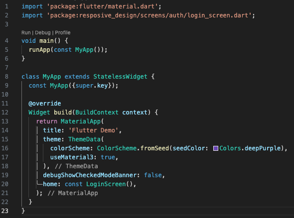
This Dart code defines the basic structure of a Flutter application. The main function launches the application, initializing it with the MyApp widget. MyApp is a stateless widget that returns a MaterialApp widget. MaterialApp is a basic widget that includes many features needed to create Material Design compliant applications.
In MaterialApp, we set the application title, color scheme, disable the debug mode banner, and set LoginScreen as the default application screen.
login_screen.dart
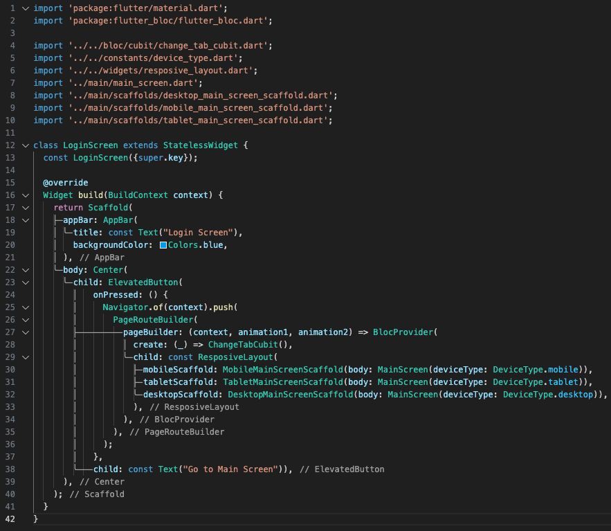
After pressing the button on the login screen, you are directed to the next screen, which is chosen by the ResponsiveLayout widget. This widget is responsible for selecting a specific Scaffold for the given device and assigning them the appropriate content. This allows us to achieve different Scaffold layouts and varied page content depending on the selected device.
responsive_layout.dart
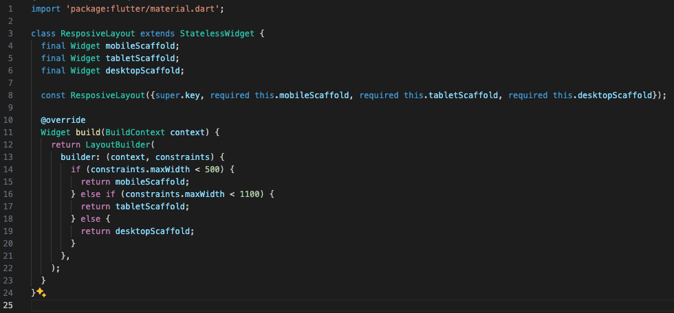
This file contains a widget that returns the appropriate Scaffold based on the specified screen width. The adopted widths are tailored to specific devices.
Thanks to this approach, we can dynamically adjust the layout of elements on the screen in response to changes in window size, both in the case of a desktop application and a web browser on a website.
If the screen width is less than 500px, the application switches to mobile mode. If it falls within the range between 500px and 1100px, it switches to tablet mode. In all other cases, the application operates in desktop mode.
main_screen.dart
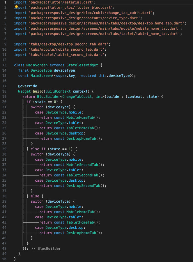
This code defines a stateless widget MainScreen that uses BlocBuilder to respond to state changes in ChangeTabCubit. ChangeTabCubit manages the currently selected tab in the application.
MainScreen takes deviceType as an argument, which determines the type of device (mobile, tablet, desktop). Depending on the state of ChangeTabCubit and the type of device, MainScreen returns the appropriate tab.
When the state of ChangeTabCubit is 0 or other than 0 and 1, MainScreen returns HomeTab for the corresponding device type. When the state is 1, MainScreen returns SecondTab for the corresponding device type.
desktop_main_screen_scaffold.dart
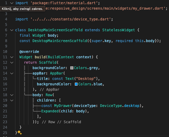
This code defines a stateless widget DesktopMainScreenScaffold, which is a scaffold for the main screen of the desktop version of the application.
The DesktopMainScreenScaffold widget takes body as an argument, which is a widget and is displayed as the main part of the screen.
Scaffold is a basic visual widget in Flutter that implements the basic material design structure for the user interface. In this case, the Scaffold has a grey background color, a blue app bar with the title “Desktop”, and a body consisting of a row (Row) of two widgets: MyDrawer (assumed to be a side menu) and body, which is dynamically passed to DesktopMainScreenScaffold.